
I recently attended a rather large gun show and picked up a couple of items that I was very happy to have found. It got me to thinking of all the great buys I have found over the years. There are of course the guns that I have bought, but this is the other stuff.
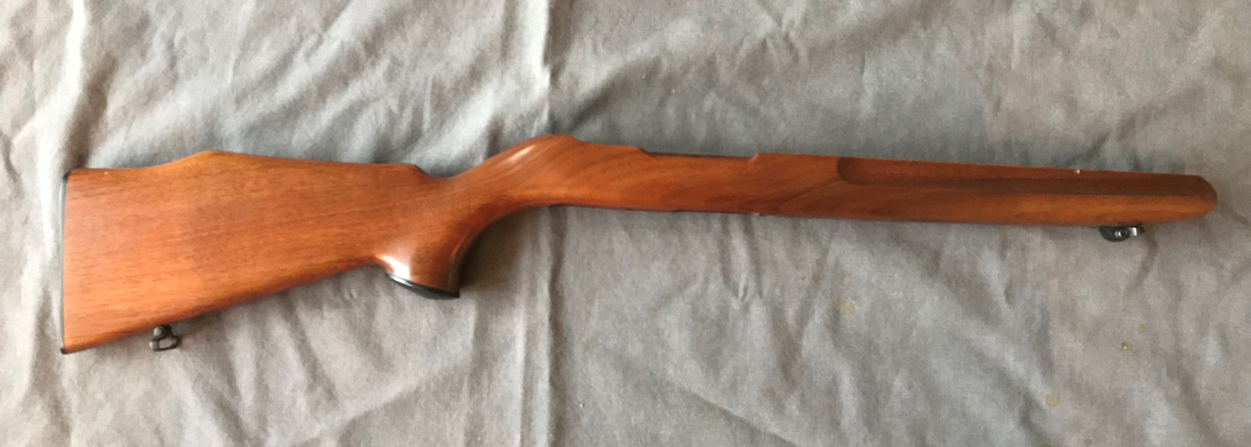
I found this VG condition, vintage Ruger 10/22 Finger Groove Sporter Stock (1966-71) for $55

a few years ago I found a black Glaco Miami Classic should holster for a Glock 17/19-22/23 for just $25.

I once found this threaded ER Shaw bull barrel for a 10/22 for just $40, he had two others, but another guy bought those before I had a chance to.

Another recent find was some NOS brass in 25-20 Winchester. I purchased one of the last boxes of Winchester ammo shortly after getting my Model of 1892 rifle, but now you cannot find the ammo. So I bought the dies and had been hoping to find the brass. At the last gun show a guy had 300 pieces of Remington and Winchester new brass, I bought all 300. (not the real picture, but you get the idea). The price was 50 cents each ($50 per 100 pieces), but considering what others were charging, this was a bargain.

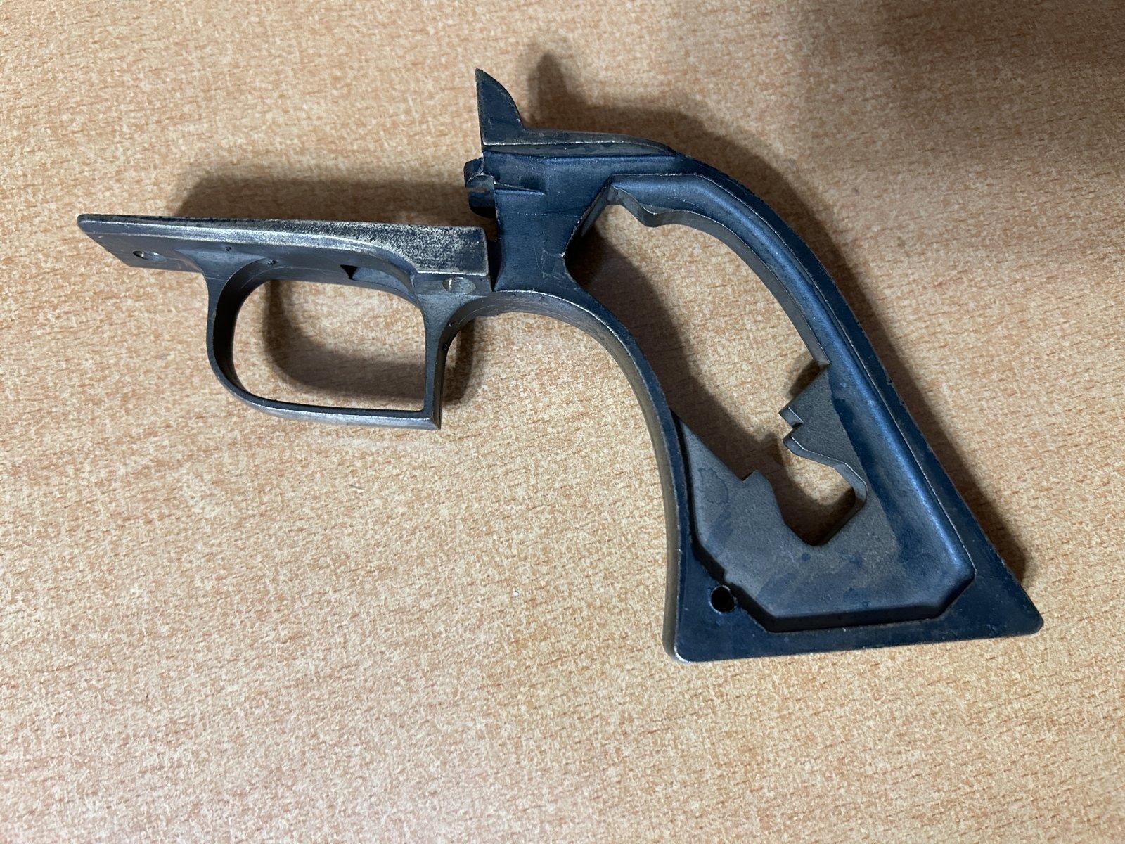
Another excellent 10/22 find was this SR-22 chassis (no rifle, just the stock components), for those that don't know these were brand labeled for Ruger by Nordic Components. Ruger introduced the model in 2009 and it only lasted a couple of years. Anyway I bought this set-up including the chassis, butt stock and Ruger monogramed Hogue grip for just $60


.jpg)


.jpg)


%20%E2%80%A2%20Instagram%20photos%20and%20videos%20and%2011%20more%20.png)


%20Pinterest%20%E2%80%A2%20The%20world%E2%80%99s%20catalog%20of%20ideas.jpg)


.jpg)

